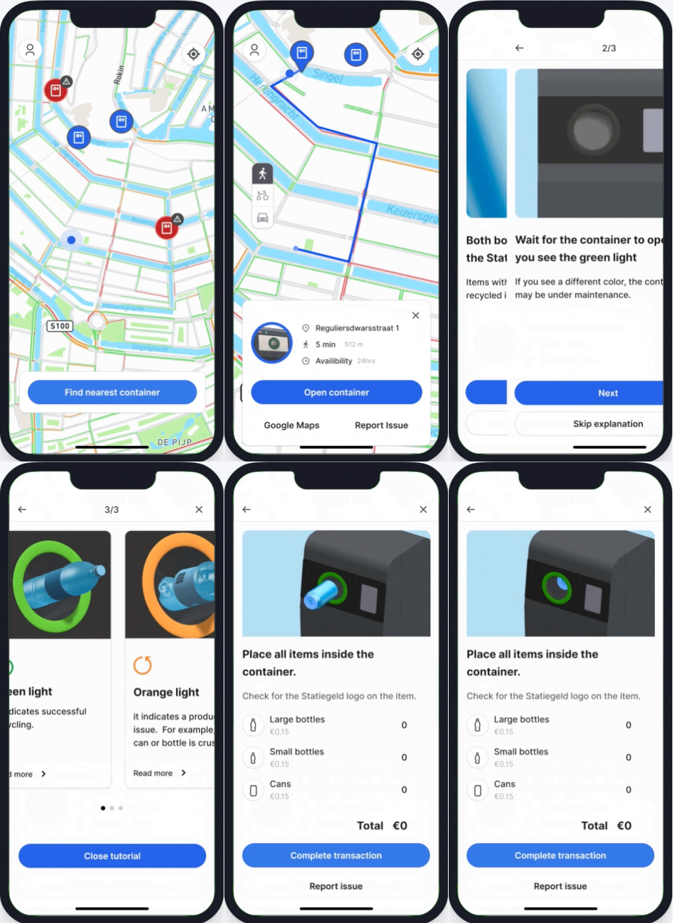
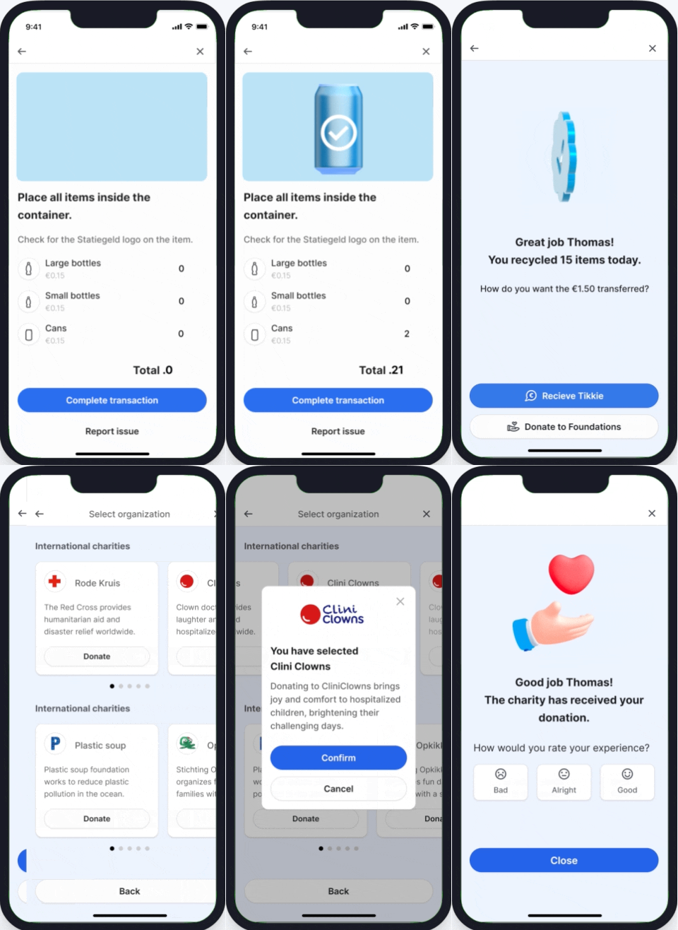
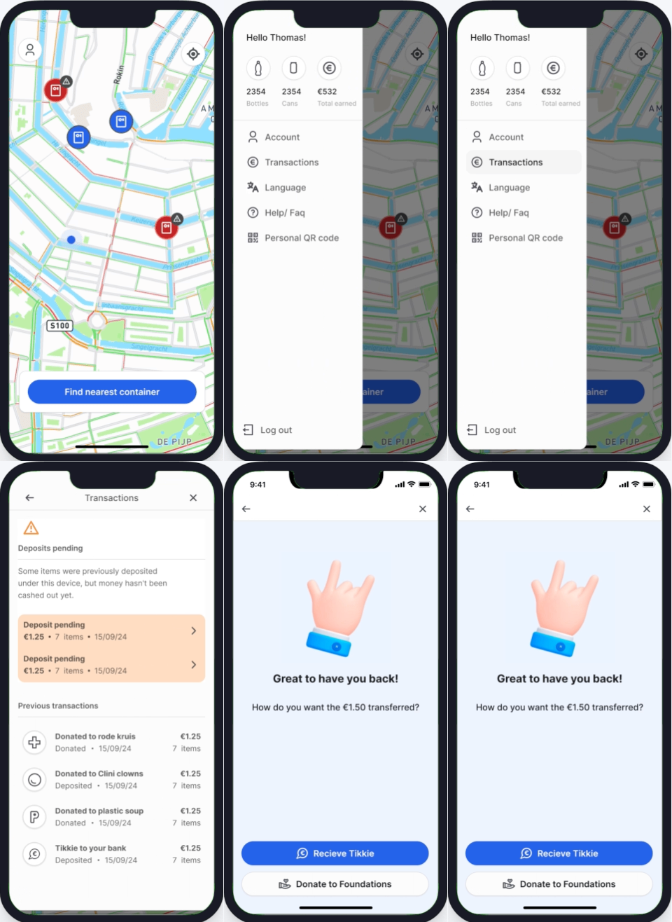
Making recycling easier for users in a rush.
Working in collaboration with Statiegeld Nederland and Mr. Fill, we developed an app designed to help users recycle their cans and bottles more efficiently in Amsterdam.
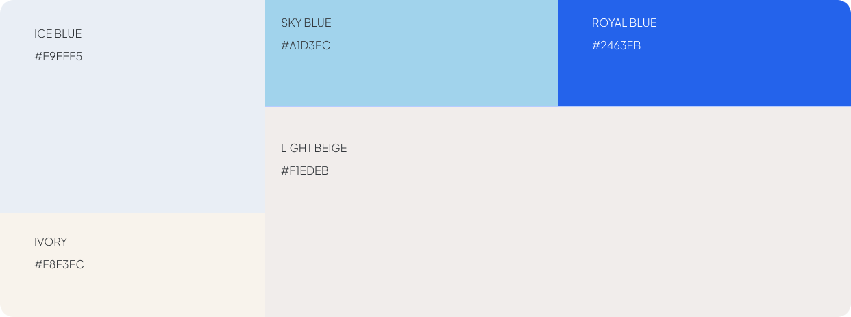
My goal was to establish a cohesive visual identity for Statieapp across all digital touchpoints while enhancing the overall user experience of the app itself.
The problem
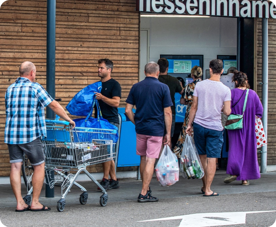
Since Statigeld introduced its deposit return system, users have faced several unexpected challenges. These problems have created frustration and are limiting the system's overall effectiveness in promoting recycling.

Main Insights
After conducting many interviews with users and stakeholders, we identified several key pain points that present valuable opportunities for improvement.
How might we streamline the recycling process to make it a quick, and rewarding experience for users?
Ideation
After conducting many exploratory interviews and doing usability tests with the current page, we concluded that designing distinct user flows for both pre- and post-purchase stages is essential. This underscored the importance of organizing and prioritizing information to create a successful, user-centered website.
Website
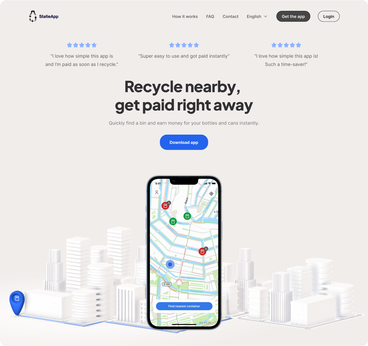
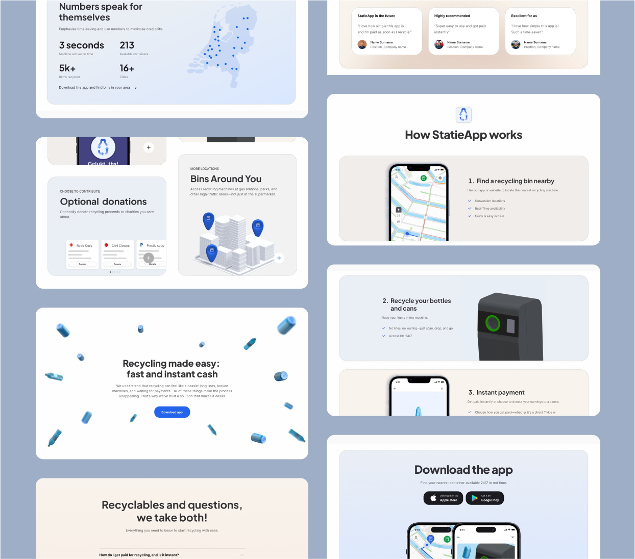
After completing the app, I was tasked with creating a website to encourage users to download and explore it. The primary goal was to showcase a premium product experience, capturing users' attention while providing a concise overview of the app's functionality and key benefits.
Ready to rock?
I'm here to help. Let's explore how we can work together

